Showing posts with label networking. Show all posts

Tuesday, August 7, 2012

Edward Tufte: The AdAgeStat Q & A


Edward Tufte.


In Which We Discuss the Role of Data in Presentations, How Media Underestimates Its Audience, and How to Create Trust in the Agency Pitch Process

by: Matt Carmichael Bio
November 09, 2011  
              
   
Last month I joined 500 or so people who paid $380 a head to sit in a packed New York ballroom and … read.

Edward Tufte, the current dean of all things information design, considers reading to be a "high-resolution data dump" -- after all, people can typically read faster than a speaker can talk. Mr. Tufte, a professor emeritus at Yale, is perhaps PowerPoint's most famous critic. He prefers a more academic and lecture-oriented format to his talks. Before he says a word, he expects you to spend some time reading selections from the nicely boxed set of four of his books included in his lecture price. "The Visual Display of Quantitative Information" is one of the most successful self-published books in history. (Mr. Tufte owns his own publishing company.) Nearly a quarter million have taken one of these sessions, offered many times a year throughout the U.S., including this sold-out three-day stint in Manhattan. He even has his own gallery, ET Modern in New York's Chelsea art district, which exhibits his sculptures and prints. Mr. Tufte had a personal brand before the there was such a thing. When even Seth Godin is in awe of your marketing ability, you clearly understand how to sell.

The audience at the New York event was a mix of designers, journalists, architects, marketers and people who clearly spend a lot of time on both sides of the PowerPoint projector. They had come to hear the man generally considered to the biggest thinker in the uber-trendy field of data visualization. Mr. Tufte has testified before Congress, advised presidents and coined terms such as "chartjunk" and "chartoons" to mock cutesy clutter thrown into presentations. He has created high-density graphic elements such as Sparklines, which are now built into Excel (Microsoft doesn't hold a grudge about the PowerPoint thing, it seems).

We chatted briefly before his talk and he agreed to field some questions to kick off an AdAgeStat Q&A series with visualization experts. His emailed responses came from his iPad.

AdAgeStat: Data reporting and visualization is all the rage in (print and online) news media these days. This is good in many ways, but often leads to a lot of malpractice. What news organizations do you think are doing it well, and are there some that you feel are overdoing it?

Mr. Tufte: On the interwebs, I think The Guardian is the best-designed newspaper and that The New York Times does the best visualizations by far.

AdAgeStat: Can visualizations make it easier for journalists/pundits/advertisers, etc. to "lie with numbers?"

Mr. Tufte: No, lying comes from the producer of the content, not the mode of production. Also highly produced visualizations look like marketing, movie trailers, and video games and so have little inherent credibility for already skeptical viewers, who have learned by their bruising experiences in the marketplace about the discrepancy between ads and reality (think phone companies).

AdAgeStat: In journalism, there's now a lot of pressure to wear many hats in budget-strapped newsrooms. Many writer-type folks are working on their own graphics. Is that a bad idea? Should we leave it to the pros or are there some simple rules that can keep us in line?

Mr. Tufte: Better to let the content people do the design than commercial artists. That is the secret of The New York Times' work: their visualization people are called "Graphics News Reporters" and they gather their own information as reporters. At a minimum, the content person should fully guide the hands of a designer and get design out of the way. Good content reasoners and presenters are rare, designers are not.

AdAgeStat: Can a good speaker make up for bad PowerPoint with what he/she actually says?

Mr. Tufte: PowerPoint benefits the bottom 10% of presenters by forcing them to have points, some points ... any points at all. And the best 10% of presenters have such good content, style and self-awareness that PowerPoint does little damage. PowerPoint should be used solely as a projector operating system to show 100% content, without the bullet grunts, logos and the formatting nonsense from the Strategic Communications Department, and the $20 million Pentagram corporate format guidelines. Such formats are about their precious turf-possessed selves and are the enemy of information and often truth.

AdAgeStat: You seem generally fond of Apple products. Is Keynote any better than PowerPoint or is the entire slide-like presentation format flawed?

Mr. Tufte: The inherent defect is the low resolution of materials that must be legible at 30 feet. But if the full screen is 100% content, then both PowerPoint and Keynote are fine. Keynote has a greater elegance than PowerPoint. The point is to avoid the PowerPoint cognitive style: hierarchical, bullets grunts, low resolution, and often about PowerPoint rather than the content. I found this to be even the case at NASA, where PowerPoint trumped rocket science -- and the Columbia Accident Investigation Board agreed with and published my analysis in their final Report.

AdAgeStat: In our industry, marketers (clients) often feel overwhelmed with the data available to them. Agencies love to churn out data, or as they say "actionable intelligence." So for the two sides of the agency/client relationship: If I'm a client getting pitched by a potential new agency, or an agency offering some new creative work, what should I watch out for? And if I'm an agency how can I make my case more credibly and honestly?

Mr. Tufte: First: "overwhelming data" is a bit of a hoax. Many of the time measurements have enormous serial correlation (just because you can measure to the millisecond doesn't mean you've learned anything about a process that moves to a monthly rhythm) and extreme high collinearities in the things measured (as in the endless web metrics, many of which are measuring the same thing over and over). Finally, most website data bizarrely and deliberately overstates the extent and intensity of website activity.

Second: overload, clutter, and confusion are not attributes of information, they are failures of design. So if something is cluttered, fix your design, don't throw out information. If something is confusing, don't blame your victim -- the audience -- instead, fix the design. And if the numbers are boring, get better numbers. Chartoons can't add interest, which is a content property. Chartoons are disinformation design, designed to distract rather than inform. Thus they reduce the credibility of your presentation. To distract, hire a magician instead of a chartoonist, for magicians are honest liars.

Third: the way to reason about what appear to be complex information spaces is to develop a sense of the relevant, of being able to identify crucial issues and interventions in complex information spaces. Steve Jobs had a great sense of the relevant.

Presenters need (1) to tell a coherent story and (2) to convince their audience of their credibility. A good way to gain credibility is not to have lied to the same audience last month. Another is to demonstrate that you are not a cherry picker, basing your case on evidence selection rather that on evidence. Another necessity is to demonstrate your mastery of detail. And, an important secret of good presenting is to finish early. Your audience will be thrilled and delighted.

AdAgeStat: While a well-crafted table might be the best way to convey a set of data properly, can there be value to creating a visualization that's eye-catching as a design element? In other words, as journalists, we often hear that our readers don't want just a big table, they want to be able to quickly visualize things in an eye-catching, unique way. Is that a fallacy?

Mr. Tufte: Graphics are at their best for really large data sets, as in sparklines for time series and NASA's photographs of the Earth. Sensibly-designed tables usually outperform graphics for data sets under 100 numbers. The average numbers of numbers in a sports or weather or financial table is 120 numbers (which hundreds of million people read daily); the average number of numbers in a PowerPoint table is 12 (which no one can make sense of because the ability to make smart multiple comparisons is lost). Few commercial artists can count and many merely put lipstick on a tiny pig. They have done enormous harm to data reasoning, thankfully partially compensated for by data in sports and weather reports. The metaphor for most data reporting should be the tables on ESPN.com. Why can't our corporate reports be as smart as the sports and weather reports, or have we suddenly gotten stupid just because we've come to work?

AdAgeStat: What are some tips for telling a story visually to an audience that's less data-inclined than say, you or I are?

Mr. Tufte: I think designers and marketers greatly underestimate their audiences.


Friday, August 3, 2012

Book Review: Visual Complexity Mapping Patterns of Information

Linkfluence Book Review by Regine, September 8, 2011


0aaloingkfluen5.jpg
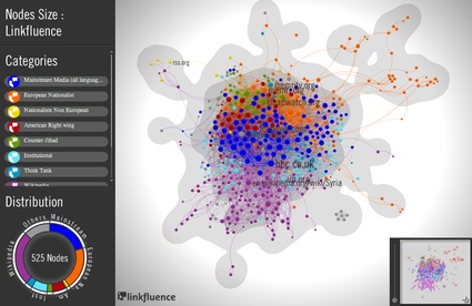
Linkfluence for The Guardian, Anders Breivik's manifesto mapped

I woke up to the news that Linkfluence had been asked by The Guardian to examine and map the webpages Anders Breivik's manifesto are linking to, along with the pages that these in turn link to. I guess it's a way for the Brit daily to celebrate the fact that, unlike Lacoste, it occupies only a negligible place in the gunman's life.

In any case, the story provided me with a smooth and apropos start of a day dedicated entirely to the browsing, reading and right now blogging of one of the latest books that have landed on my desk this Summer.


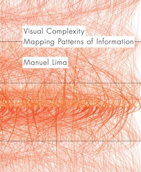
9cover989365.jpgVisual Complexity, Mapping Patterns of Information by Manuel Lima

Publisher Princeton Architectural Press writes:
Our ability to generate information now far exceeds our capacity to understand it. Finding patterns and making meaningful connections inside complex data networks has emerged as one of the biggest challenges of the twenty-first century. In recent years, designers, researchers, and scientists have begun employing an innovative mix of colors, symbols, graphics, algorithms, and interactivity to clarify, and often beautify, the clutter. From representing networks of friends on Facebook to depicting interactions among proteins in a human cell, Visual Complexity presents one hundred of the most interesting examples of information-visualization by the field's leading practitioners. Author Manuel Lima has been called the "Edward Tufte of the 21st century" and nominated as one of the "50 most creative and influential minds of 2009" by Creativity magazine.


rewiri3ng_the_spy.jpg
Lisa Strausfeld and James Nick Sears, Open Source Spying, 2006

I'm not an information designer. I don't follow as closely as I should what moves and shapes the world of network representation. However, I'm not a complete neophyte and i've received enough books about infoviz to recognize that this one is a gem. The volumes i've been sent over the past few years are either glossy coffee table books containing jaw-dropping images and scarce information or they are heavy accumulations of knowledge and theory that fall out of my indolent hands and brain at the second chapter. Taking the best of both world, the visual punch and the informed text, Visual Complexity, Mapping Patterns of Information has everything it takes to satisfy the curious and the expert alike. It's a precise and pleasant book that does justice to the practice of infoviz and i'm sure that it will be an invaluable reference for the whole design community for years to come.

If Lima knows how to use images to filter and make complex nodes of data more apprehensible, he also seems to be a master in transferring the power of clarity into words.The author writes in a limpid and seemingly effortless way about the 'Ubiquitous Datasphere', 'Segmented Radical Convergence' or 'Multivariate Analysis". No theory entanglements, no information confusion.


Nuremberg_chronicles_-_Genealogy_of_Henry_II_(CLXXXVIv).jpg
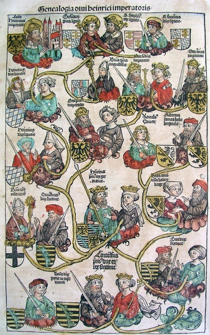
Genealogy of Henry II, Illustrations from the Nuremberg Chronicle, by Hartmann Schedel, 1493

But what's inside the book?

The first chapter, devoted to the trees of life, brings us back to Aristotle and his study of classifications and sub-classifications in Organon. The second chapter moves from trees to network thinking and introduce us to nonlinear ways of envisioning and organizing information. Chapter three, "Decoding Networks' gets deeper into the subject with paragraphs about the pioneers of infoviz and a list of 8 principles that aim to help the work network visualization designers. Next comes a chapter that dissects the most popular subjects of network visualization: exchanges of information on blogs, bibliographic citations, donations to political candidates or environmental organizations, terrorist cells, etc. Chapter 5, 'The Syntax of a New Language' explores the visual techniques designers chose to portray a particular topic. Diagrams, Implosions, Globes, Circles, Spheres, etc. Chapter 6 definitely sold me to the book. with its foray into sculptures and art installations that evoke and translate networks.
Visual Complexity opens on an essay by Lev Manovich and closes with contributions by prominent figures in the world of infoviz: Nathan Yau, Andrew Vande Moere, Christopher Kirwan and David McConville.


4_final99944.jpg
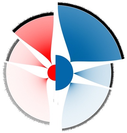
Wesley Grubbs and Nick Yahnke, 2008 Presidential Candidate Donations: McCain vs. Obama, 2007-2008


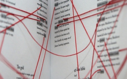
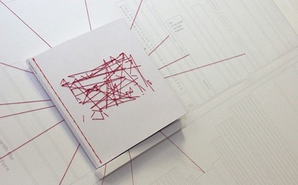
typographic_links_02.jpg
typographic_links_01.jpg
Dan Collier, Typographic Links, 2007
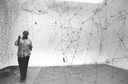
Goldschmidt_gertrud_03.jpg
Gertrud Goldschmidt, Reticulárea, 1969

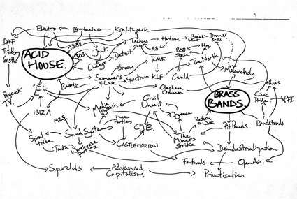
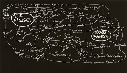
And this is where i'm going to apologize to the wonderfully talented designers whose work is featured in Lima's book. I could have chosen one of their information visualizations to illustrate the post on the homepage, I was actually finding it hard to chose a particular project until i found an entry about Jeremy Deller's History of the World on the blog Visual Complexity. Jeremy. Deller. How could i resist? If Manuel Lima himself believes that my favourite artist is fit to be featured in his blog, how could i not jump on the opportunity to put yet another Deller on my homepage?
2013331-PMR-deller.jpg
artwor333k_images_424371779_391606_jeremy-deller.jpg

Manuel Lima Visual Complexity: Mapping Patterns of Information Slideshare Link


As a former art and design instructor, I had to have this art book once I learned of it, so I ordered a copy from Amazon. The link below will take you to a slideshare site with many of the visuals from the book.


Visual Complexity: Mapping Patterns of Information by Manuel Lima

Our ability to generate information now far exceeds our capacity to understand it. Finding patterns and making meaningful connections inside complex data networks has emerged as one of the biggest challenges of the twenty-first century. In recent years, designers, researchers, and scientists have begun employing an innovative mix of colors, symbols, graphics, algorithms, and interactivity to clarify, and often beautify, the clutter. From representing networks of friends on Facebook to depicting interactions among proteins in a human cell, Visual Complexity presents one hundred of the most interesting examples of information-visualization by the field's leading practitioners.
"Visual Complexity is a showcase for the intersection of art, design and science...Some of the examples are indeed silly. Some are profound. Many are decidedly beautiful. And all are fascinating, given the infinite kinds of data that can be visualized." -- New York Times Book Review


"A rigorously researched, beautifully designed, thoughtfully curated anthology of the world's most compelling work at the intersection of two relatively nascent yet increasingly powerful techno-cultural phenomena, network science and information visualization....A powerful tool in your visual literacy arsenal for navigating the Information Age. From the Bible to Wikipedia edits to the human genome, the gorgeous and thought-provoking visualizations in the book will make you look at the world in a whole new way, and the insightful essays accompanying them will vastly expand your understanding of the trends and technologies shaping our ever-evolving relationship with information." -- Brain Pickings

"Artistic analysis...tremendous potential for shaping how we understand our world...if you are the type who obsesses on Google Analytics or just feel the need to nerd out for a bit, pick up a copy." --Cool Hunting

"From genealogical patterns in medieval tapestries to the math behind fractals, Lima, a senior UX design lead for Bing, shows how designers turn complex patterns into compelling artwork." -- Wired

"Incredibly ambitious, deeply researched, and beautifully illustrated." --frieze
"Intellectually ambitious...the author engages this heady material with a surprisingly sharp and lucid eye." -- Metropolis

"Manuel Lima, the New York-based founder of visualcomplexity.com, works at the forefront of network science and information visualization. Appropriately, his book Visual Complexity cuts through digital clutter, using colorful examples to illustrate these fields." -- Surface magazine
About the Author
Manuel Lima is the founder of VisualComplexity.com and a Senior UX Design Lead at Microsoft. He is a Fellow of the Royal Society of Arts and was nominated by Creativity magazine as "one of the 50 most creative and influential minds of 2009".

Manuel Lima is a leading voice on information visualization and a frequent speaker in conferences and schools around the world, including TED, Lift, OFFF, Reboot, VizThink, IxDA Interaction, Royal College of Art, NYU Tisch School of the Arts, ENSAD Paris, University of Amsterdam, MediaLab Prado Madrid.

Here's the slideshare link:

http://www.slideshare.net/manulima